10:00
9 Spatial Operations
9.1 Spatial joins
Simple features data can be joined to other data sets in two ways. We can either use a traditional, SQL like join, based on a value shared across the data sets or, since we have a geometry column, on the spatial relationship between the data sets. This is known as a spatial join, where variables from one data set are joined to another only on the basis of their spatial relationship. The most commonly used operation is known as a Point-in-Polygon join where data from a polygon is joined to the points within them.
In sf spatial joins are handled using the st_join(x, y) function with arguments:
- x -
sfobject to which we are joining data (LHS in SQL) - y -
sfobject whose variables are being joined (RHS in SQL)
We will be joining the subcounty shapefile to the health facility location data.
9.1.1 Exercise
- Create a new dataframe called
kenya_healthby runningst_join()betweenkenya_2017andhealth_sf - Inspect it using
head()orglimpse()to see what columns have been added.
Solution
kenya_2017 <- st_make_valid(kenya_2017)
kenya_health <- sf::st_join(kenya_2017, health_sf)
head(kenya_health)Simple feature collection with 6 features and 29 fields
Geometry type: MULTIPOLYGON
Dimension: XY
Bounding box: xmin: 35.28185 ymin: 0.0663135 xmax: 35.59058 ymax: 0.5589468
Geodetic CRS: WGS 84
Shape_Leng Shape_Area ADM2_EN ADM2_PCODE ADM2_REF ADM2ALT1EN ADM2ALT2EN
1 1.746986 0.04082931 Ainabkoi KE027144 <NA> <NA> <NA>
1.1 1.746986 0.04082931 Ainabkoi KE027144 <NA> <NA> <NA>
1.2 1.746986 0.04082931 Ainabkoi KE027144 <NA> <NA> <NA>
1.3 1.746986 0.04082931 Ainabkoi KE027144 <NA> <NA> <NA>
1.4 1.746986 0.04082931 Ainabkoi KE027144 <NA> <NA> <NA>
1.5 1.746986 0.04082931 Ainabkoi KE027144 <NA> <NA> <NA>
ADM1_EN ADM1_PCODE ADM0_EN ADM0_PCODE date validOn ValidTo
1 Uasin Gishu KE027 Kenya KE 2017-11-03 2019-10-31 -001-11-30
1.1 Uasin Gishu KE027 Kenya KE 2017-11-03 2019-10-31 -001-11-30
1.2 Uasin Gishu KE027 Kenya KE 2017-11-03 2019-10-31 -001-11-30
1.3 Uasin Gishu KE027 Kenya KE 2017-11-03 2019-10-31 -001-11-30
1.4 Uasin Gishu KE027 Kenya KE 2017-11-03 2019-10-31 -001-11-30
1.5 Uasin Gishu KE027 Kenya KE 2017-11-03 2019-10-31 -001-11-30
FID Facility Number Facility Name HMIS
1 2070 1 AINABKOI HEALTH CENTRE 1914
1.1 2073 3 ASURURIET S.D.A DISP 4858
1.2 2080 6 BURNT FOREST RURAL HEALTH DEMONSTRATION CENTRE 1927
1.3 2132 24 KAPNGETUNY DISP 1881
1.4 2144 27 KAPTAT DISP 1886
1.5 2156 30 KATUIYO DISP 2967
Province District Division LOCATION Sub Location
1 RIFT VALLEY UASIN GISHU AINABKOI OLARE KAPKENO
1.1 RIFT VALLEY UASIN GISHU AINABKOI OLARE KAPKENO
1.2 RIFT VALLEY UASIN GISHU AINABKOI OLARE KAPKENO
1.3 RIFT VALLEY UASIN GISHU AINABKOI KAPNGE'TUNY SILIBOI
1.4 RIFT VALLEY UASIN GISHU AINABKOI KAPTAGAT TENDWO
1.5 RIFT VALLEY UASIN GISHU AINABKOI KIPKUBUS SONGICH
Spatial_Re Facility Type Agency
1 HD MAPS 3 MISS
1.1 HD MAPS 4 MISS
1.2 HD MAPS 3 MOH
1.3 HD MAPS 4 MOH
1.4 DISTRICT ESTIMATES 4 MOH
1.5 HD MAPS 4 MOH
GlobalID x y
1 b42c82c3-2e40-4ed0-b68d-dcc461d4952e 3947000 25729.01
1.1 e3e81d6d-7012-428d-a96c-c318643cbc47 3947000 25729.01
1.2 674c6f1d-f343-4345-919f-e67bbe0fd557 3945909 25774.43
1.3 15a567f3-6d47-4ce8-8d46-588204f1befc 3959690 15233.86
1.4 943ad52b-cbd2-471f-9521-d2176b0034c2 3945619 51475.80
1.5 9231301e-2885-4307-8b38-17ed6df2571f 3942858 36720.50
geometry
1 MULTIPOLYGON (((35.35823 0....
1.1 MULTIPOLYGON (((35.35823 0....
1.2 MULTIPOLYGON (((35.35823 0....
1.3 MULTIPOLYGON (((35.35823 0....
1.4 MULTIPOLYGON (((35.35823 0....
1.5 MULTIPOLYGON (((35.35823 0....Now that kenya_2017 is attached to our observations we can create summary statistics for each subcounty, and plot them at the subcounty level As mentioned before, we can use tidyverse functions on sf objects. Here, we will use dplyr to calculate the total number of facilities in each subcounty.
9.1.2 Exercise
10:00
- Create summary statistics per subcounty for the total number of health facilities. You will need to use
group_by()andsummarise()
Solution
health_facilities <- kenya_health |>
group_by(geometry, ADM2_EN) |>
summarise(num_facilities = n())`summarise()` has grouped output by 'geometry'. You can override using the
`.groups` argument.At this stage it is a good idea to save our data. We can do this using the st_write() function. It needs an sf object and the path and name of the output.
9.1.3 Exercise
10:00
- Copy and execute the following code to save your data:
st_write(health_facilities,"output/health_facilities.gpkg)
9.2 Making better maps
Now that we have processed our data we can start mapping it. So far we have only used the geom_sf() function from the ggplot2 package. This creates a default map and is great when all we want to do is quickly visualise our data. The full range of ggplot2 (and ggspatial) functions gives us control over all elements of the final plot and allows us to create high quality maps.
ggplot(sf_object) +
geom_sf(aes(fill = name_of_column)) +
labs(title = title_of_map)9.2.1 Exercise
10:00
- Start by specifying which
sfobject is being mapped inggplot()and what column holds the values to be visualised. We will also change the legend’s title.
Solution
ggplot(health_facilities) +
geom_sf(aes(fill = num_facilities)) +
labs(fill = "Number of health facilities")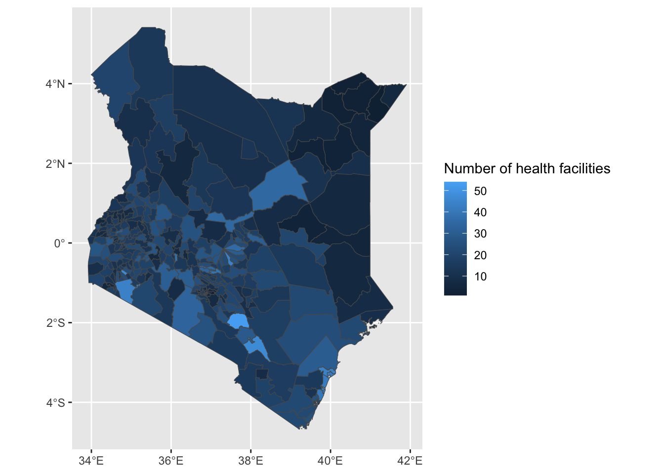
- Now let’s add
nairobi_boundaryto have a thicker line around Nairobi. Let’s also change the colours used.
Solution
ggplot() +
geom_sf(data = health_facilities, aes(fill = num_facilities)) +
geom_sf(data = nairobi_boundary, fill = NA, color = "black", size = 1) +
labs(fill = "Number of health facilities") +
scale_fill_gradient(low = "white", high = "purple")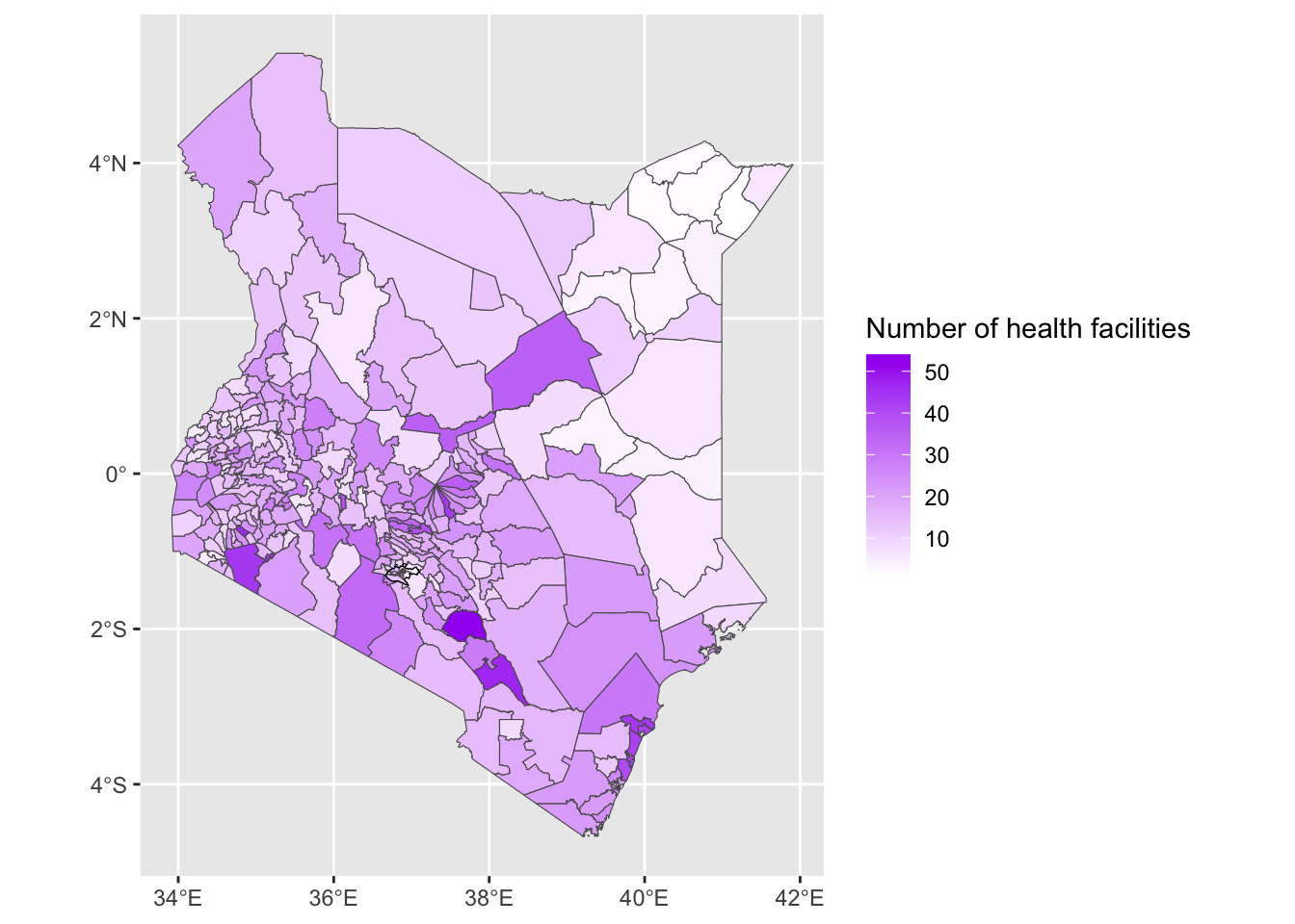
- Next we will add a scale bar and position it in the bottom left corner.
Solution
# First, install and load ggspatial if not already available
# install.packages("ggspatial")
ggplot() +
geom_sf(data = health_facilities, aes(fill = num_facilities)) +
geom_sf(data = nairobi_boundary, fill = NA, color = "black", size = 1) +
annotation_scale(location = "bl") +
labs(fill = "Number of health facilities")+
scale_fill_gradient(low = "white", high = "purple")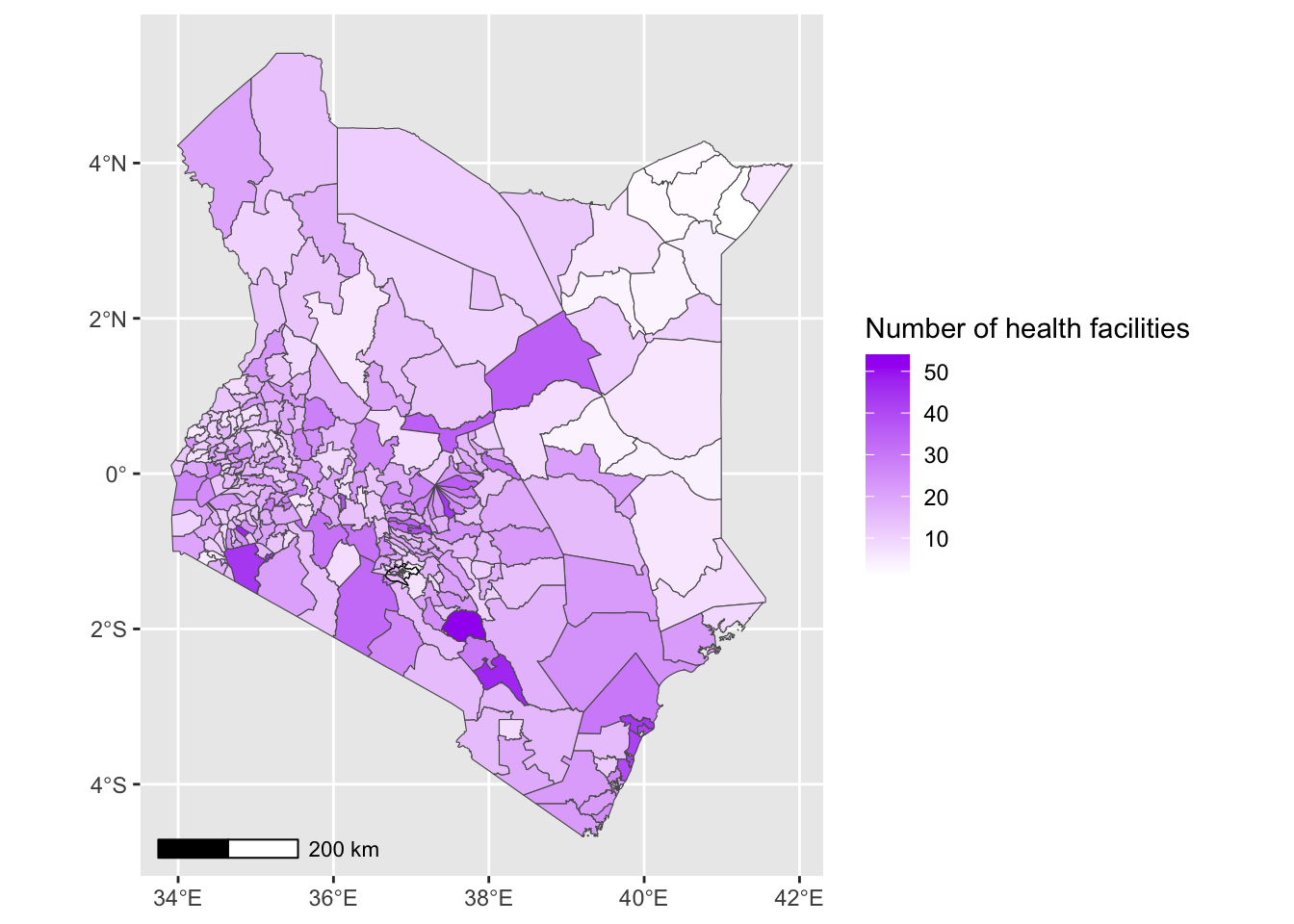
- We can now remove the black frame from the map and add a title to our map.
Solution
ggplot() +
geom_sf(data = health_facilities, aes(fill = num_facilities)) +
geom_sf(data = nairobi_boundary, fill = NA, color = "black", size = 1) +
annotation_scale(location = "bl") +
labs(
title = "Kenya Health",
fill = "Number of health facilities"
) +
scale_fill_gradient(low = "white", high = "purple")+
theme_minimal() +
theme(panel.grid = element_blank())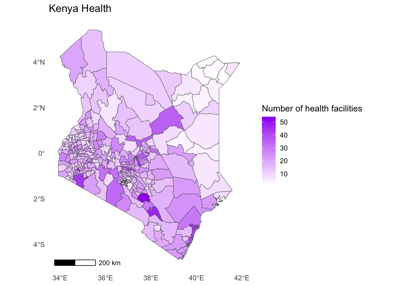
- All of the map elements are now visible but they’re not in the right place. We can solve this by increasing the margins around our map. This will allow the title and the legend to move outwards.
Solution
ggplot() +
geom_sf(data = health_facilities, aes(fill = num_facilities)) +
geom_sf(data = nairobi_boundary, fill = NA, color = "black", size = 1) +
annotation_scale(location = "bl") +
labs(
title = "Kenya Health",
fill = "Number of health facilities"
) +
scale_fill_gradient(low = "white", high = "purple")+
theme_minimal() +
theme(panel.grid = element_blank(),
plot.margin = margin(0.5, 0.5, 0.5, 0.5, "cm")
)
Finally, save your map as an R object and export it.
Solution
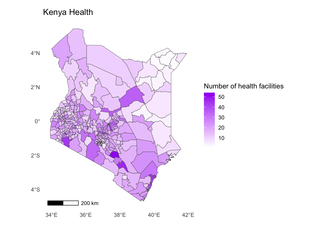
health_map <- ggplot() +
geom_sf(data = health_facilities, aes(fill = num_facilities)) +
geom_sf(data = nairobi_boundary, fill = NA, color = "black", size = 1) +
annotation_scale(location = "bl") +
labs(
title = "Kenya Health",
fill = "Number of health facilities"
) +
scale_fill_gradient(low = "white", high = "purple")+
theme_minimal() +
theme(panel.grid = element_blank(),
plot.margin = margin(0.5, 0.5, 0.5, 0.5, "cm")
)Solution
# Save the map
ggsave("output/maps/health_facilities.png", health_map, width = 8, height = 5)You can also view your choropleth as an interactive map.
Solution
health_map <- ggplot() +
geom_sf(data = health_facilities, aes(fill = num_facilities)) +
geom_sf(data = nairobi_boundary, fill = NA, color = "black", size = 1) +
annotation_scale(location = "bl") +
labs(
title = "Kenya Health",
fill = "Number of health facilities"
)
# Convert to interactive plot
interactive_map <- ggplotly(health_map)Warning in geom2trace.default(dots[[1L]][[1L]], dots[[2L]][[1L]], dots[[3L]][[1L]]): geom_GeomScaleBar() has yet to be implemented in plotly.
If you'd like to see this geom implemented,
Please open an issue with your example code at
https://github.com/ropensci/plotly/issuesSolution
interactive_map